The complete visual language for GenZ4GTM — colors, icons, symbol grammar, and usage rules for every creative touchpoint.
9 brand colors across three tiers — primary, secondary, and background.
Each color has a defined role. Use these rules consistently across all creatives — posts, cards, UI, and print.
26 icons across 5 categories. Consistent 2px stroke weight, 48×48 viewBox, rounded line caps throughout.
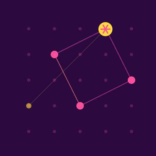
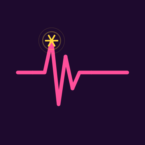
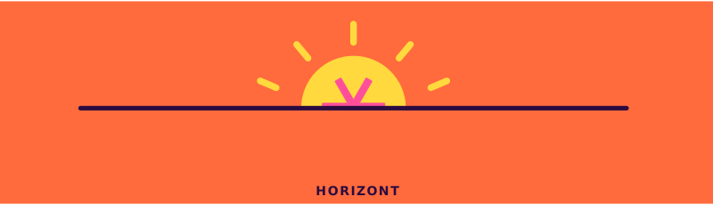
Large-format single icons — Konstellation, Frequenz, and Horizont. Each is a self-contained composition designed for hero use, social posts, and full-bleed placements.
Decorative standalone elements — used as texture, dividers, and accent marks in layouts. Available large (top row) and small (bar variants).
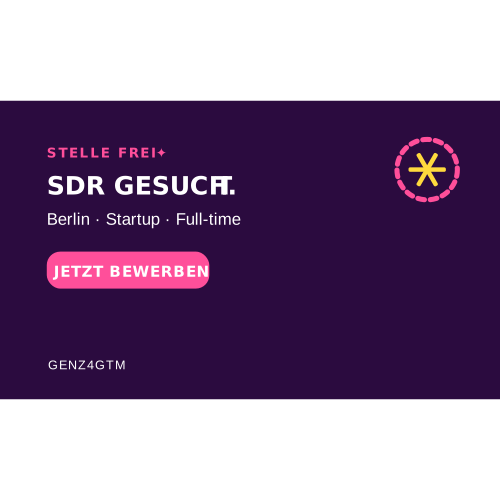
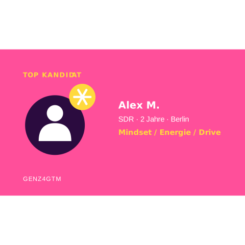
How icons appear inside product UI — cards, tags, and grammar bars.
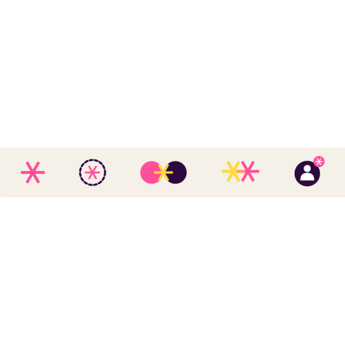
The asterisk/star symbol carries specific meaning depending on context and combination.
Two typefaces — ARGANDIR Bold for display & headlines, Poppins for body, labels, and UI text.